2021
Agency: Tribal WorldWide Istanbul
Re-Branding
Mobile App Design
Visual Identity
Introduction
CLIENT
GittiGidiyor/eBay is one of the first marketplaces established in Turkey 19 years ago. With 100,000 sellers and 31 million registered users, GittiGidiyor has always been a company that closely follows innovations, focusing on elevating the user experience to the highest level. As part of this vision, in 2011, it joined the umbrella of eBay, one of the global leaders in e-commerce.
GittiGidiyor/eBay offers millions of products in 50 categories ranging from electronics to decoration, cosmetics to mother-baby products, and fashion to supermarkets. In addition to SMEs and individual sellers, GittiGidiyor/eBay, being an eBay company, hosts hundreds of local and foreign major brands, connecting Turkish brands and products with 183 million active users in 190 countries.
TASK
The client approached us with an existing brand; however, this brand was generic, inconsistent, and did not reflect the product's innovativeness. The long-unrenewed brand identity and inconsistencies in the user experience on the brand's mobile and web applications were leading to serious perception problems.
SOLUTION
We revisited the brand's journey, starting with a new corporate identity, and strengthened the relationship between the user and the brand identity. The best way to solve this was to design a simple yet modern corporate identity and effectively increase its visibility in web and mobile applications. Because the biggest problem the brand faced was its inability to adequately represent its corporate identity on its most crucial platforms: web and mobile applications. Therefore, in ATL activities, it appeared as one brand on the web and a different brand on mobile apps. In this newly created world, we established an innovative, modern, and integrated GittiGidiyor/eBay brand.
/Re-Branding

Logotype Re-Design
Old Logo

New Logo
The emblem in the old logo was particularly challenging, especially for an e-commerce brand, in web and mobile applications. We decided to remove the emblem that carried the colors of the main brand, eBay, and integrate those colors directly into the logo. The new logo was written with "GittiGidiyor Planc", a font family specifically designed for GittiGidiyor/eBay, making it compatible with the digital world. During the design of the new font, it was specifically crafted to prevent pixel breakage on screens, ensuring its suitability for the digital environment.
Typography

Custom Font Design: TAF Studio
The emblem in the old logo was particularly challenging, especially for an e-commerce brand, in web and mobile applications. We decided to remove the emblem that carried the colors of the main brand, eBay, and integrate those colors directly into the logo. The new logo was written with "GittiGidiyor Planc", a font family specifically designed for GittiGidiyor/eBay, making it compatible with the digital world. During the design of the new font, it was specifically crafted to prevent pixel breakage on screens, ensuring its suitability for the digital environment.


Primary Colors
One of the significant changes during the re-branding process was in the primary color usage. The shift of competitors in the market towards warmer colors (such as Hepsiburada.com using yellow, Trendyol using orange, and N11 using red) led us to designate blue as the primary color in the GittiGidiyor/eBay logo. In doing so, we differentiated from competitors, moving away from the previous dominance of white and began to merge the perception of GittiGidiyor with the color blue.


Secondary Colors & UI Extended Palette
🛑 These colors are used exclusively in digital applications. It is not appropriate to use them in any communication materials.


Iconography

After GittiGidiyor's brand renewal, they developed three innovations in the user experience section of the mobile app and changed the visuals within the app. By carrying the softer lines of the new logo into the mobile world, they transformed all design elements into a rounded style.
Mobile App Re-UI Design
Fully Rounded System


Button Actions


Home Screen Re-Design
Innovative approach for a social home page.
Although GittiGidiyor is an e-commerce company, feedback from many users indicated that the homepage was overwhelming and diminished shopping motivation. We needed to maintain this structure commercially while adopting an innovative approach. Based on recent trends in social media behavior, we redesigned the first part of the homepage to align with social media dynamics. We directed users toward familiar behaviors by presenting categories in a story format. In banners, we maintained visual emphasis but used less text and graphics to make banners resemble an Instagram post, attempting to create a sense of emotional connection. Thus, we simplified the user's shopping journey, making it more emotional and redesigning the first part of the homepage. The original page was preserved upon scrolling, continuing the e-commerce dynamics on a lower page.


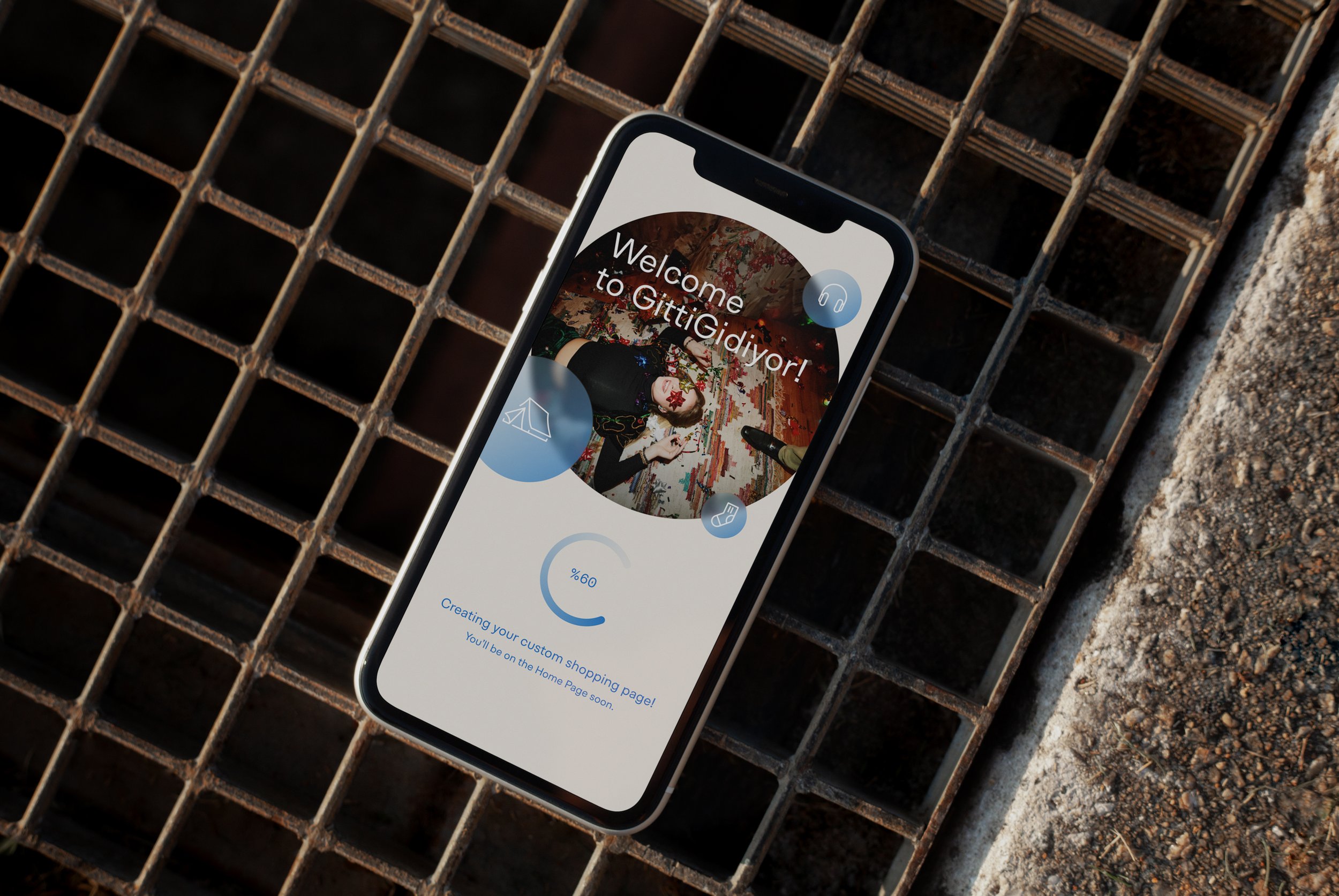
"Welcome in Three Steps!"
GittiGidiyor now offers a simpler and quicker user experience with its new 3-step welcome page, initiating a personalized shopping journey. After entering personal information, the second step involves selecting an address. Once the address is provided, relevant categories are chosen. Following category selection, a personalized shopping suggestion, comprising popular items from these categories, appears on the user's screen.
Users can enhance this list with their likes and saved products. The welcome page is designed for a fast and simple shopping experience, ensuring it doesn't overwhelm users initially. Additional information for different experiences can be entered in later stages.


Welcome Page User Experience.